Introduction
In today's digital world, your website is often the first impression customers have of your business. With mobile users making up over 60% of web traffic in 2025, having a responsive website is no longer optional—it's essential.
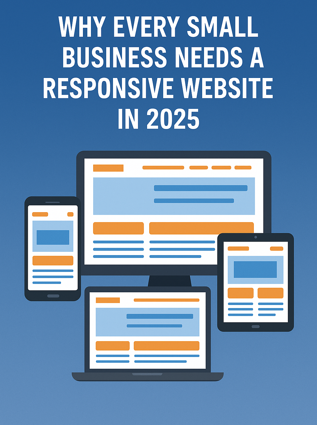
What is a Responsive Website?
A responsive website automatically adjusts its layout and content to fit the screen size of the device it's being viewed on, whether it's a smartphone, tablet, laptop, or desktop.
Why Responsive Design Matters in 2025
- Mobile-First Indexing: Google primarily indexes the mobile version of websites.
- Improved User Experience: A seamless experience across devices keeps visitors engaged.
- Better SEO Rankings: Google favors responsive websites in its search algorithms.
- Increased Conversions: Easier navigation means higher chances of lead generation and sales.
- Future-Proofing: Responsive design ensures your site works with newer devices and screen sizes.
Common Mistakes Businesses Make
- Using separate mobile sites
- Ignoring page speed on mobile
- Failing to test on multiple devices
How Applause IT Solutions Helps
At Applause IT Solutions, we specialize in crafting fully responsive, SEO-friendly websites tailored for small businesses. Our team:
- Uses mobile-first frameworks and modern UI/UX principles
- Conducts device testing and performance optimization
- Ensures your brand looks great on any screen
- Integrates contact forms, chat, and lead capture tools that work seamlessly
Whether you're starting from scratch or revamping your current site, Applause IT Solutions is your go-to partner for creating a digital presence that performs.
Conclusion
A responsive website is more than just a design trend—it's a business necessity. Don't let an outdated website hold you back in 2025. Partner with Applause IT Solutions to build or upgrade your site today.
Contact Us Now - sales@applauseitsolutions.com